

Professional Bohemian Printed Carpet Styling Tips for a Cozy Eclectic Home
2026-10-07
Bringing a bohemian printed carpet into your living space is one of the fastest ways to inject warmth and personality—but styling it without veering into visual chaos takes a bit of know-how. From layering textures to balancing bold patterns, these professional tips will help you create that cozy, eclectic vibe you’re after. Trust Senseco to guide you through transforming your home with confidence and creativity.
Layer a Sun-Faded Kilim Over a Chunky Jute Rug
There’s something quietly magnetic about pairing a sun-faded kilim with a chunky jute rug underneath. The worn, dusty hues of the kilim seem to settle into the rough, organic weave of the jute, creating a layered look that feels collected rather than decorated. The contrast isn’t loud—it’s the kind that draws your eye slowly, letting you notice how the soft, faded pattern plays against the thick, uneven texture below.
When you layer these two, scale matters more than you might think. Let the jute extend a good twelve to eighteen inches beyond the kilim on all sides, giving the arrangement a generous border that keeps the kilim from looking like it’s floating in the middle of the floor. If the kilim has a dominant faded tone—say, a washed-out terracotta or a dusty indigo—pick it up somewhere else in the room, even faintly, so the pairing feels intentional without being matchy. Don’t fuss over perfect alignment; a slightly off-center placement often looks more natural, as if the rugs have lived together for years.
Maintenance is simpler than it appears. The jute will shed and leave a fine dust underneath, so give both rugs a good shake outside a few times a year rather than relying on a vacuum’s beater bar, which can pull at the loose fibers. Rotate the kilim every couple of months if the room gets strong sunlight—that fading you love will keep moving gently across the surface instead of turning one corner into a pale ghost. And if the edges of the kilim start to curl, a few small pieces of rug tape placed near the corners will hold everything down without damaging the weave.
Let a Busy Carpet Dictate the Room's Accent Palette
A room's accent palette shouldn't be an afterthought—it can emerge naturally from the rug beneath your feet. Instead of picking wall art or throw pillows first, let the carpet's dominant hues and subtle undertones steer the direction. If your rug carries deep terracotta and dusty rose, those exact shades can reappear in a vase, a lampshade, or the piping on a cushion cover. The result feels less decorated and more organically composed.
The key is not to match every color perfectly but to borrow the rug's quieter notes. Pull a muted olive from the border pattern and use it on a single accent chair. Lift a sliver of warm cream from the fringe and let it show up in ceramic tableware. Working this way keeps the palette cohesive without turning the room into a showroom display. You're not cloning the carpet—you're extending its visual logic into the rest of the space.
If you're unsure where to start, stand back and squint at the rug. The colors that still register at a distance are your anchor points. Use those for larger upholstery or drapery, then save the intricate, up-close tones for smaller accessories. This hierarchy mirrors how the eye naturally moves across a room, letting the carpet quietly dictate the rhythm of the entire accent scheme.
Hang a Small Printed Rug Behind the Bed Instead of a Headboard
A headboard can feel like a commitment, but a small printed rug hung on the wall brings the same warmth without the weight. Look for a vintage kilim or a flat-woven piece with colors you already love in your bedding—muted rust, dusty blue, faded ochre. A simple wooden dowel slipped through the top hem and mounted on hooks keeps the look relaxed, not fussy.
The texture is what makes this trick work. A rug adds a soft, almost tactile layer behind your pillows, which makes the whole bed feel more grounded. If you rent or just like to rearrange often, you can swap the rug seasonally or move it to another room in minutes. No heavy lifting, no holes beyond two small anchors.
For a more collected look, layer a smaller rug with a woven wall hanging or lean a narrow bench at the foot of the bed. The key is to avoid matching everything too perfectly—let the rug’s faded pattern act as the starting point for the room’s color story, then scatter in linen and wood tones that feel lived-in.
Mix Tribal Motifs with Clean-Lined Furniture, Not Matching Sets
Pairing a carved wooden stool or a handwoven textile with a sleek sofa creates an unexpected tension that makes the room feel collected rather than decorated. The key is letting the tribal piece hold its own without surrounding it with other rustic items that compete for attention. A single bold pattern against a backdrop of smooth, unadorned surfaces reads as intentional, not accidental.
Avoid buying furniture as a set if you want the space to feel alive. Instead, choose one or two clean-lined foundational pieces—a low-profile bed frame, a simple dining table, a modular lounge chair—and let the tribal motifs act as accents. This approach keeps the eye moving and gives the room a layered history without tipping into theme-park territory.
Think of the tribal element as jewelry for the room. A mudcloth pillow on a crisp white sofa, a beaded Yoruba crown resting on a minimalist shelf, or a geometric Berber rug under a glass coffee table adds character without heaviness. The contrast between the organic, handmade quality and the precision of modern lines is what makes the combination feel fresh and deeply personal.
Angle a Runner Through the Kitchen for an Unexpected Gallery Vibe
Most runners get shoved into hallways or lined up like soldiers beside a kitchen island. But skewing one on a diagonal across the floor does something stranger and better: it breaks the room’s hard geometry and pulls the eye along a slash of color, the way a museum might hang a single long canvas off-axis to keep the room from feeling static.
Pick a low-pile wool or flatweave runner that can handle scuffs and spilled oil, then let it cut from the sink zone toward a less expected anchor—maybe the foot of a bookcase or a door that rarely gets used. The angle creates a false vanishing point, making a cramped kitchen feel wider while giving the floor the casual confidence of a gallery hallway with a one-off installation.
Don’t fight the traffic patterns. If the diagonal crosses the work triangle, choose a runner with a border pattern that can handle being stepped over, and let its edges brush the toe kicks of cabinets. That slight disorder is the point: it keeps the room from looking decorated in a straight, predictable line, and instead makes the floor read as an intentional, slightly rebellious exhibit.
Embrace Fringe and Imperfect Edges as Part of the Story
The worn corner of a rug, the slight warp in a handmade ceramic bowl, the uneven hem on a quilt stitched by hand — these are not flaws to hide. They carry the weight of use, the memory of a maker's hands, the honest mark of time passing. When we stop trying to smooth every rough edge, we let an object tell a fuller story. The fringe that frays a little at the end is the same fringe that once brushed against a wooden floor in a different home, under different light, during a different season of someone's life.
Imperfection becomes a kind of signature. No machine can replicate the hesitation in a brushstroke, the slight asymmetry of a hand-thrown pot, or the patch on a favorite jacket that doesn't quite match. These small irregularities invite us closer. They ask us to slow down and notice what happened here, what was repaired, what was left unfinished on purpose. In a world that often demands polish and uniformity, choosing to live with frayed edges is an act of attention — a quiet refusal to erase the evidence of a life actually lived.
The story is richer when the edge is not perfectly straight. A table with a crack filled in gold, a linen curtain faded unevenly by the sun, a notebook with pages dog-eared and coffee-stained — each one holds a narrative that can't be bought new. By welcoming these details, we stop treating objects as disposable backdrops and start seeing them as companions with histories of their own. The fringe and the imperfect edges don't diminish the story; they are the story, threading through every tear and mend.
FAQ
Aim for at least the front legs of your main seating pieces to rest on the rug. In smaller rooms, leave a 12–18 inch border of floor visible around the edges. Oversized rugs can make a compact space feel more intimate, while a too-small rug tends to break the flow.
Keep the color palette shared. Pull one or two hues from the carpet into pillows, throws, or curtains, then vary the scale of patterns—large medallions on the floor, small geometrics or florals on textiles. If the rug is very busy, let solid colors and textures like rattan or linen balance the eye.
Low-profile pieces with natural wood frames, wicker, cane, or worn leather sit beautifully on boho rugs. Avoid matching sets; instead pick one standout item like a vintage trunk as a coffee table and keep other pieces visually lightweight so the carpet remains the anchor.
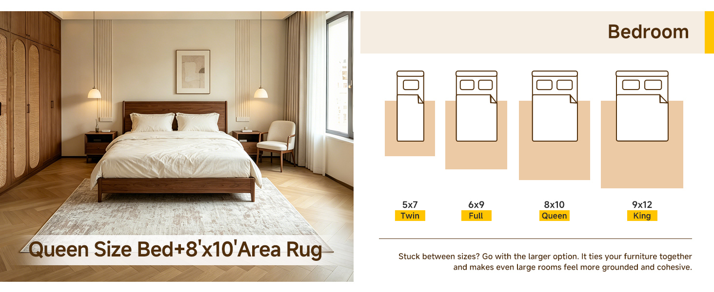
Yes, place it under the lower two-thirds of the bed with enough rug extending on the sides and foot for bare feet. Choose a thinner flatweave or low-pile kilim if you want easy door clearance and a less overwhelming look.
Start with a large neutral base rug—jute or sisal works well—then place a smaller vivid printed carpet on top at a slight angle. This adds depth, softens footfall, and lets you change the top layer seasonally without a full room makeover.
Terracotta, ochre, deep teal, burgundy, and olive are reliable anchors. Mix them with cream or warm gray to keep the space from feeling heavy. If you prefer a lighter look, blush, mustard, and faded indigo with natural wood tones also read as cozy.
Vacuum without a beater bar twice a week, rotate the rug every few months, and blot spills immediately with a dry cloth. Every year or two, have it professionally cleaned, especially if it has fringe or delicate dyes.
Conclusion
Layering a sun-faded kilim over a chunky jute rug instantly warms the floor and adds depth without making the space feel busy. The dusty, sun-bleached tones of the kilim play against the rough, natural texture of jute so the room feels lived-in rather than staged. Once that base is down, let the busiest printed carpet in the room guide the accent palette. Pull specific colors from the rug, like ochre, faded teal, or a muted brick red, and echo them only in a few cushions, a ceramic bowl, or a soft throw. This avoids the matching-set trap while keeping the room from turning chaotic. In the bedroom, skip the usual headboard and hang a small printed rug behind the bed instead. It brings softness, pattern, and a quiet sense of history to a spot that otherwise goes unnoticed.
When mixing tribal motifs with furniture, keep the table and chairs clean-lined and simple so the rug carries the pattern. That contrast between old and new makes the room feel collected over time, not ordered from a single showroom. In the kitchen, lay a runner at a slight angle rather than perfectly straight. The turn pulls the eye down the length of the room and gives the space an unexpected gallery-like rhythm, especially with a directional motif. Finally, do not rush to trim fringe or straighten every wavy edge. Loose threads, slightly uneven borders, and worn spots are all part of the rug's story. They soften the room and make the whole home feel personal, layered, and quietly welcoming.
Contact Us
Contact Person: Ivy Yin
Email: [email protected]
Tel/WhatsApp: +86 18519681805
Website: https://www.sensecomarketing.com/